Harmonizing Form and Function: Unconventional Inspiration from iTunes Paves the Way for Optimal Report Design in the Age of Data-Driven Decision-Making
In the age of information overload and data-driven decision-making, the presentation of data in a clear and concise manner is more crucial than ever. For professionals like data analysts and financial app developers, the ability to efficiently interpret and manipulate large sets of data is a key aspect of their work. The quest for the perfect report design that combines functionality and aesthetics has led many to take inspiration from unconventional sources.

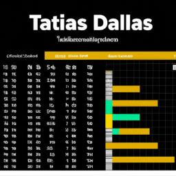
One individual, working extensively with tabular data, found unexpected inspiration in iTunes for their report design. Embracing principles like minimal padding, zebra striping, fast sorting, and a column browser interface, they honed their report layout using tools like DataTables. However, the journey didn’t stop there. The individual delved deeper into the balance between sorting and displaying data, exploring concepts like using visual cues such as colors to highlight important information in a sea of rows.
The experiment led to a critical evaluation of the design elements that worked well and those that missed the mark. From live updates and stable sorting to the challenges posed by horizontal and vertical scroll bars, every detail was scrutinized for its impact on data visualization. The individual’s keen eye for user interface density brought to light the importance of typography in enhancing information display while minimizing clutter.
The quest for optimal report design also touched upon the performance aspect, especially when dealing with large volumes of data. From the high density and performance of Windows Forms’ DataGridView control to the struggles faced in replicating the same in web frameworks like React, the journey showcased the delicate balance between functionality and speed in data-heavy applications.
Furthermore, the exploration of interactive elements and rendering challenges in frameworks like Svelte highlighted the evolving landscape of UI design and the constant pursuit of efficiency in data representation. The juxtaposition of old-school retro aesthetics with modern technology underscored the cyclical nature of design trends and the ongoing quest for the perfect blend of readability and visual appeal.
As the individual reflected on the intricacies of report design, the broader discussion expanded to encompass the evolution of UI trends and the potential shifts on the horizon. With a nod to past design cycles and a keen eye on the future of data visualization, the journey served as a reminder of the ever-changing nature of design preferences and the need to adapt to emerging technologies and user expectations.
In conclusion, the journey of revamping report design inspired by iTunes offers a glimpse into the meticulous process of balancing form and function in data visualization. From unconventional inspirations to performance considerations, every aspect of report design plays a crucial role in shaping the user experience and enhancing data interpretation. The quest for the perfect report design continues, fueled by a blend of creativity, innovation, and a deep understanding of user needs in an ever-evolving digital landscape.
Disclaimer: Don’t take anything on this website seriously. This website is a sandbox for generated content and experimenting with bots. Content may contain errors and untruths.
Author Eliza Ng
LastMod 2024-07-28